Key takeaways
Doctrine: clarity
In government, military or religious organizations, a doctrine is a fundamental, guiding principle (or set of principles). The guiding principle when making a science presentation (or any presentation) is clarity. If your presentation is clear, the audience is more likely to understand it and to remain engaged with you until the end. On the other hand, an unclear presentation will quickly result in the audience losing interest. The success or failure of your presentation hinges on this one element: clarity.
Tips for making clear slides:
Selecting and using images
Coming soon!
The aesthetics of slides
Below are some general guidelines to design clear, visually appealing, slides. There is a subjective element when making decisions about the visual aspects of your slides. After all, we are now deep in the territory of art. You may disagree with some of these suggestions and decide to do the exact opposite. This is all right. Do whatever is aesthetically pleasant for you, and make it the best that it can be.
Do not reinvent the wheel: There are plenty of websites that provide free templates for PowerPoint presentations. Take advantage of these and use a template as a starting point for your presentation. You can then modify it to fit your subject and style. Some good sources for templates: Slidesgo and Canva.
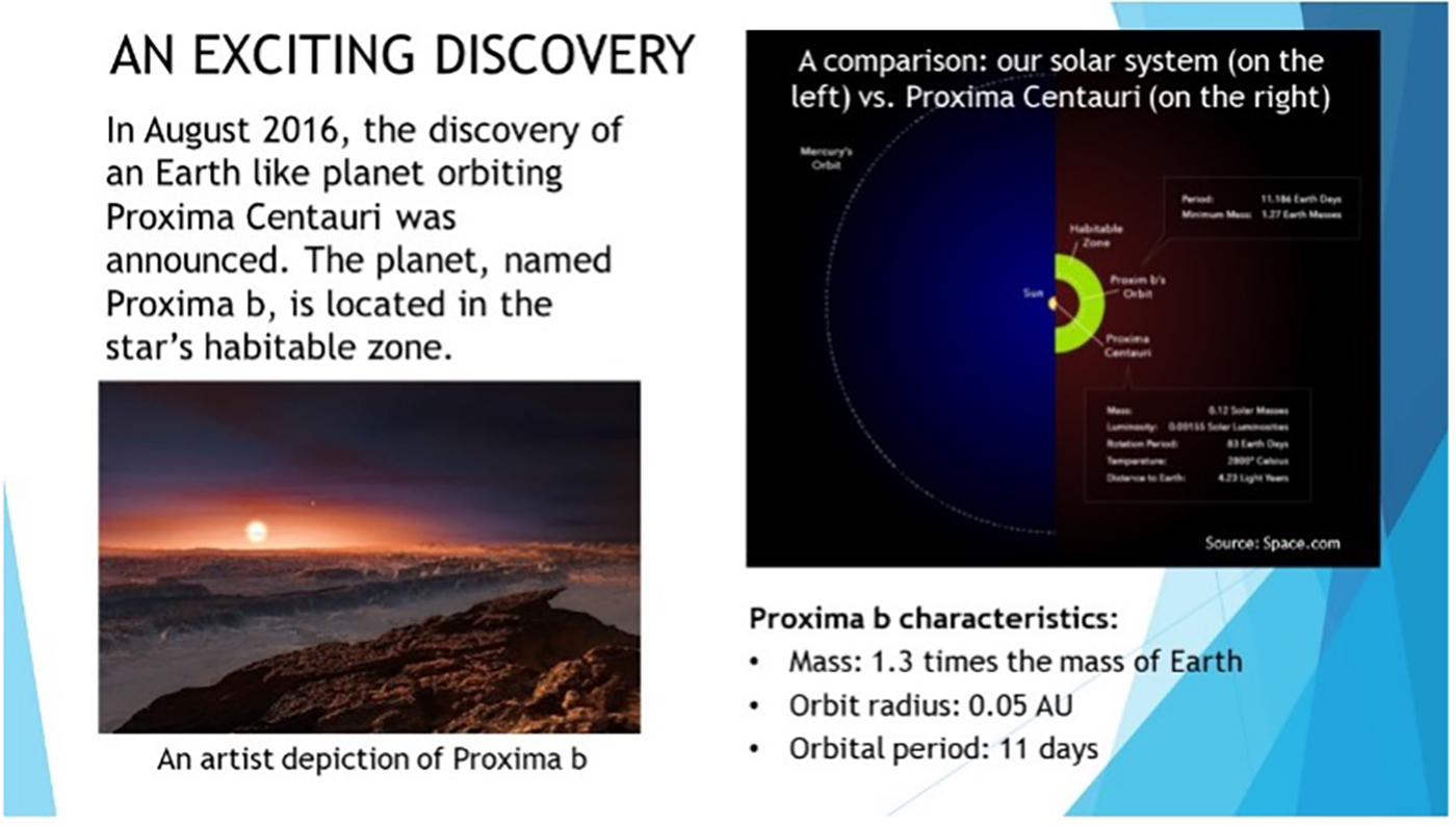
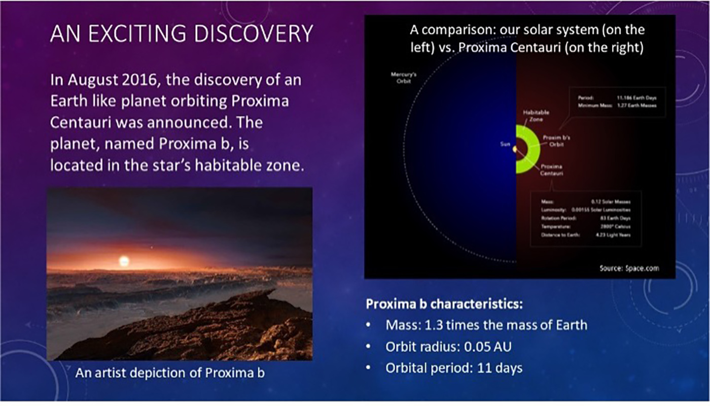
Choose the right background color: You may have already heard that light color text on dark background is better for slides. It is the opinion of the author of this guide that dark background is more comfortable for the eyes, and a better choice in most cases. But this is not a general rule. Ultimately, choice of background color should be driven by the topic of the presentation. Which color scheme is most evocative for your topic? For example, a talk about plants may benefit from either dark or light background with green/organic tones and highlights. For an astrophysics presentation, a dark blue or a black background is a safe choice. Below is a comparison of two slides: a light background, and a dark background. Which one do you prefer?
Maximize contrast: High contrast between the text and the background is more pleasant aesthetically and makes reading easier. Avoid mid-tone backgrounds that are not too bright or too dark. If you have doubts, cycle through several text colors to find the best fit. If you cannot find a suitable text color, change the background.
Select the right fonts: choosing the right fonts with the right size for your text is a high impact decision. A bit of terminology: Serif fonts have little “wings” at the end of their lines, like the font being used right now, have a classical old-fashion feel, and are good for printed documents. Sans-serif fonts have a slick and modern look and are recommended for text printed on the screen. You can, however, choose to combine a sans-serif font for your main text with a complementary serif font for your titles. This font pairing technique can create interesting visual dynamics. For font size, bigger is better. Use at least size 22-24 for the main text and 32 for titles. If you are unable to fit all your text on the screen with fonts of that size, you probably have too much text. Cut. You can find additional information and a top 10 list of best fonts for PowerPoint here.
Video – In this short exercise, we analyze the visual flaws of a slide, and then produces a new version, fixing those flaws: https://youtu.be/6G4hbO5jL_4