TECHNIQUE Poster Competition
During the Winter 2019 semester, S.P.A.C.E. put out a call to Illustration students at Dawson College to propose a poster that would serve as the public visual representation of the upcoming S.P.A.C.E. theme.
 In 2019/2020, the theme was TECHNIQUE, and so in early 2019 S.P.A.C.E. met with interested Illustration students to explain the various aspects of TECHNIQUE that we hoped would be portrayed in the poster.
Six students created posters as well as reflections on their work that they pitched to the S.P.A.C.E. team. Three of these poster prototypes and reflections appear below. (Note: at the time that the students were working on their posters, S.P.A.C.E. was playing with the idea of an M-dash to replace the “N” in TECHNIQUE, creating TECH-IQUE, though this idea was later dropped.)
As we are every year, the S.P.A.C.E. team was impressed by the thought, attention to detail and indeed technique that each student displayed in their proposal.
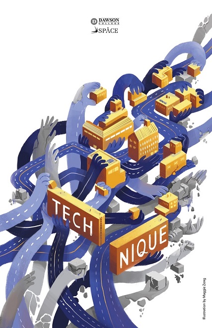
On the left is the final version of the 2019/2020 S.P.A.C.E. theme poster created by Maggie Zeng.
At the time of the competition the Illustration students were in the second year of the Illustration program. Below are three prototypes, and, reflections on the process of creating experienced by the students.
 Audrey Gravel
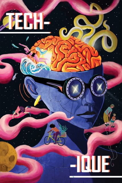
To begin with my creative process, the first question I asked myself was ''What is technique?'' for me.
The clearest thing that came to mind was that technique was about learning, but not only that. It's also about going above and beyond what you currently can achieve. It's about learning new ways of thinking and adapting with new techniques, new goals and new limits by constantly evolving with what's around you, at the same time that the world is evolving as well.
Technique doesn't really matter with where you are in life - Young, Old, Student, Self-employed, Employee, Artist - since it's about doing something different than the others, by evolving with yourself and what you love. It's about where you come from, and where you will go.
My interpretation of technique represents this particular school of thought. This life-long learning curve with all the roads that you have to borrow from to go where you want to go.
In her work, Audrey Gravel loves to produce art that strikes the viewer’s curiosity through light and color. She is constantly inspired by her surroundings, the Victorian era, and Japanese Culture. She creates her version of the world through diverse mediums but mostly through digital painting, gouache and pastel. You can view more of Audrey's work through her Instagram.
***
 Chaimae Khouldi
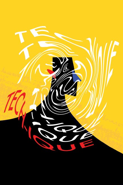
As I came to think about the concept of "TECH-NIQUE", the first thing that popped into my head was my childhood. What were our ways of learning as we grew older? We painted, drew, counted and played with blocks, things that were mostly done using the three primary colours, which is why my colour palette (except for my character) consists of only bright red, yellow and blue. I also wanted to represent technique as a sensory thing: something that is heard, seen, touched and felt, something that is unclear to the eye, a learning and sensory experience, as seen through the waves and the blobs on the poster, with the title moving and shifting in front of the character. Finally, I wanted to feel the contrast, the simplicity and the fluidity of the concept of TECH-IQUE.
Chaimae Khouldi is currently finishing her 3rd year in Illustration, where she likes to play with shapes and composition. If she had to describe her style in three words, it would be bold colours, contrast with a touch of texture. You can view more of her work through her Instagram.
***

Maggie Zeng
If I had to describe my concept in a single line, it would be "a city endlessly building itself". I wanted to convey the idea of a community built through the sharing of technique. I chose to do this through the image of hands interconnected and intertwined. The goal was to represent the idea of passing down technique from generation to generation or from individual to individual. However, because we are so fixated on “progress”, we might fail to see that we sometimes lose sight of what matters. As a result, I wanted to express a certain ambiguity in regards to our use of technique. Here, the city is a puzzle that is gradually put together (or perhaps taken apart). Though all the pieces fit, the puzzle may never be solved.
Maggie Zeng is an illustrator with a passion for storytelling. You can find more of her work through her Instagram.

Comments
Quillin Berry
January 7, 2026Hey there! I really loved the insights about the Technique Poster Competition—what a creative way to showcase talent. The blend of technology and art is fascinating! I’m curious, do you think students often find it challenging to balance their technical skills with artistic expression in projects like these? It reminds me of my own experience trying to create a 3D model for an animation class—getting lost in details but also needing that overall vision. I’d love to hear more about how participants tackle this duality!
Check snow rider 3d at https://snowrider3d.com
basketrandom
February 9, 2026Many users mention https://basketrandomonline.net/ as a handy unblocked site where they can jump into Basket Random instantly, enjoy smooth browser gameplay on PC, and have quick, funny matches whenever they need a short gaming break.
siunak
February 9, 2026The game’s evergreen allure stems from this sense of personal and collective development.
https://retrobowl-games.io
aidio
February 12, 2026It’s fascinating to see how Maggie Zeng’s poster, which depicts hands connected to symbolize the sharing of technique, reflects the idea of collaboration. I love how the concept ties into our everyday lives, almost like an inspiration for an AI Anime Generator https://aianimegen.org/ ; it’s all about continuous learning and adapting!
KeonLounch
February 22, 2026These posters are a testament to student skill! The TECHNIQUE theme really sparked creativity. Reminds me of needing clever techniques in games, like building the perfect deck in pokerogue. Collecting all the monsters in the pokerogue dex feels like mastering a challenging artistic technique too, right? Impressive how these second-year students honed their craft. https://playpokerogue.com and https://wiki.playpokerogue.com
CalebMacrossan
March 10, 2026The brief was incredibly broad, focusing on “Innovation,” and it was challenging to distill such an abstract concept into a single, impactful visual. Just like these students, I spent hours sketching and refining ideas, grappling with how to represent the theme effectively. Ultimately, I learned the importance of clearly communicating your concept and the technical skills involved. If you are feeling bored, consider https://blockblasts.io/.
juezhang
March 21, 2026The exploration of the TECHNIQUE theme in 2019/2020 by S.P.A.C.E. was both innovative and inspiring, showcasing students’ creativity through unique poster designs. For more inspiration and creative ideas, visit https://www.steal-brainrots.io —where imagination knows no bounds!
You have to be registered and logged in in order to post comments!