INTERSECTIONS Theme poster
During the Winter 2021 semester, in a co-curricular collaboration between SPACE and a 2nd year Illustration class taught by Stephanie Aubin, 43 students were presented with and discussed various aspects of the upcoming SPACE theme: INTERSECTIONS. Under the guidance of Stephanie these students developed proposals for the poster that would serve as the public visual representation of the 2021/2022 theme.
These proposals were reviewed by the SPACE coordinators along with Illustration teachers Stephanie Aubin, Mark Sy—Stephanie’s predecessor in leading this co-curricular activity—and Meinert Hansen. From the 43 submissions, 6 were chosen to present to the judging committee. The presentations which took place over Zoom included both the students’ poster and their statement about the connection between their work and the INTERSECTIONS theme.
The six poster presentations by the finalists, appear below. As we are every year, the committee was impressed by the thought, attention to detail, skill and professionalism that each student displayed in their proposals.
Directly below is the winning poster designed by Evy Voyatzis.
Evy Voyatzis
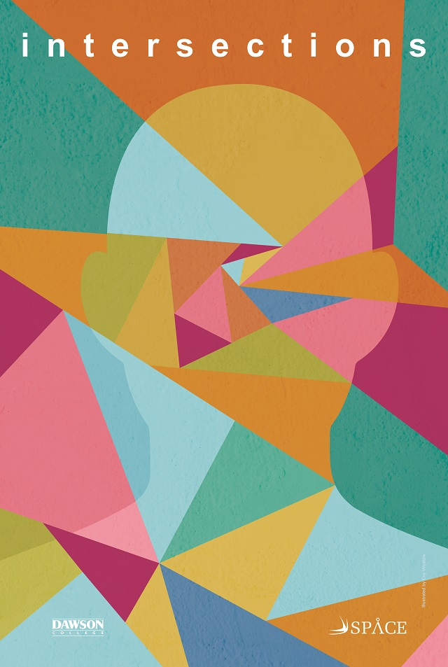
My interpretation of the theme of intersections is that all aspects of life, from nature and technology to societal issues and one’s personal life, impact each other. These infinite intersections shape the world we live in and, by extension, one’s worldview and identity.
Throughout the process of designing this poster, I wanted to represent the consequences of these intersections. I chose to include a human figure as we humans are the ones who are creating, perceiving and are shaped by these intersections.
The concept of intersections informed the colour palette of this poster. I overlapped different colours and used the hues produced from these intersections throughout the poster.
Overall, I wanted to capture how human beings, on an individual and global scale, shape the intersections present in the world and how these intersections, in turn, shape us as human beings.
Evy Voyatzis is an illustrator who specializes in digital art. She is passionate about character design and seeks to bridge her interests in science and art.
Caitlann Allan
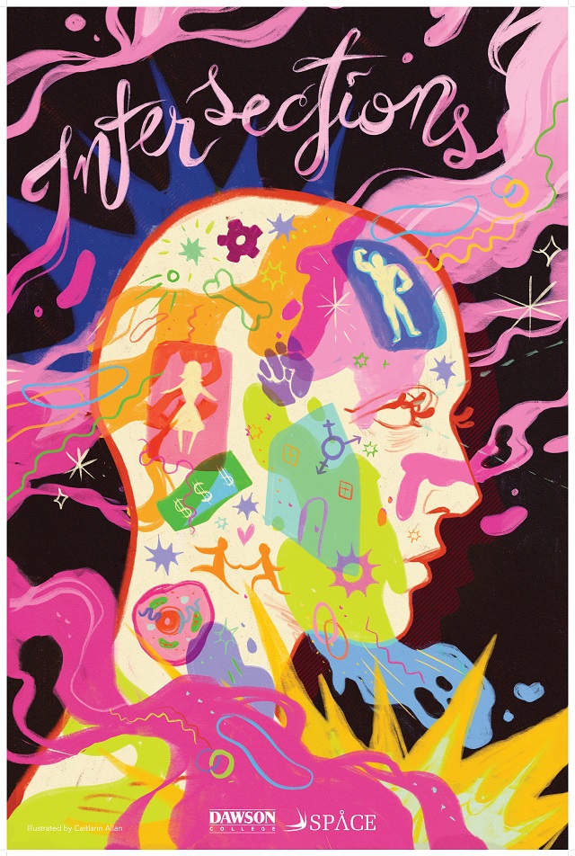
When I initially heard of the theme Intersections, I was unsure of what direction to take my piece. After much consideration I finally decided on trying to show different intersections of different ideas and identities flowing through the mind, showing bits of gender, race, love, class, money, and science swirling and intersecting throughout the mind. I also wanted lots of contrast, in both shapes and colors and bright eye-catching colors!
Caitlann Allan is an illustrator studying at Dawson College, currently based in small town St-Lazare among the many fields of clover and miniature ponies. They spend much of their leisure in their room hoarding stickers, but never seem to use them. They love to create colourful eye-catching art works and have an affinity for digital art and fake paper texture! They also are an avid graphic novel reader and would love to illustrate one eventually! You can see more of their work on their Instagram.
Marilou Choquette
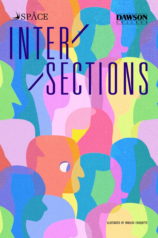
When I first read what the subject would be, I thought to myself, “Well this should be easy!” It wasn’t. Intersections can be something so vague and so broad. The whole point of its meaning is to include, bring together and highlight a numerous amount of different concepts, ideas and identities. And so, I would need to drop any attempt at illustrating this subject literally. I would let the subject speak through art and through visuals.
I remembered some of the art theory I learned early in my first semester: you can express a lot with only shapes, colours and lines. Next, I figured out a simple but affective poster composition: I assembled a bunch of humanoid looking shapes of all colours and let them intersect. I kept them all very similar but also very different. I tried my best to make them all slightly different, keeping out anything that could code them of any gender, race or sexuality, and then allowing everyone to see themselves in these little blobs. You see them march together to the right, and towards a better future where each of their differences are brought to light to celebrate them.
As a final touch, I added the eye. It brought focus to the piece, but also a new emotional weight. It would mean many things. Is it showing a new outlook on the world? Is it one person with a dream leading their companions towards a right path? All the questions and answers are up to the interpreter.
Marilou is an illustrator with a passion for gothic literature, musicals and toys. They particularly love character design, storytelling and painting. Their work can be found on Instagram at @victorianandthespian.
Mathieu Deroy
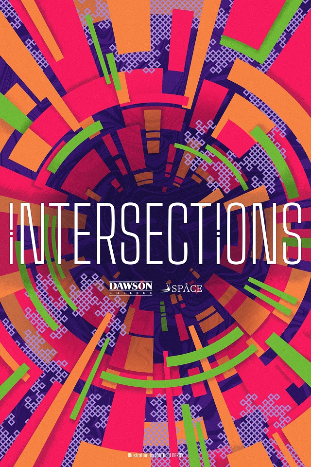
I wanted to take on the concept of Intersections in the most abstract way possible, since the theme can be interpreted in many different ways with various concepts. It can be complicated to make sense of it all as those intersections can lead to uncertain, ambiguous, but also interesting and even inviting futures.
I represented this with a slight scientific tone, as biology meeting artificiality. Lots of different sized and proportioned shapes meeting each other, forming a tunnel leading to the unknown, textured with a marbling effect. Going through the mass are instances of the dragon curve fractal, a mathematical curve that can be found all around in nature, looking machine-like at its start of simple lines meeting each other, but increasingly biological looking as it gets more complex.
Finally, the title intersects the tunnel at its center and the poster as a whole, underlining the theme.
Mathieu is coming from a background in Graphic Design and is studying Illustration at Dawson College. Aficionado of flashy colors, heavy line art and pop-culture, he mostly dabbles in digital painting and pen & ink renderings. You can find more of his work through his Instagram page.
Layloo Lapierre
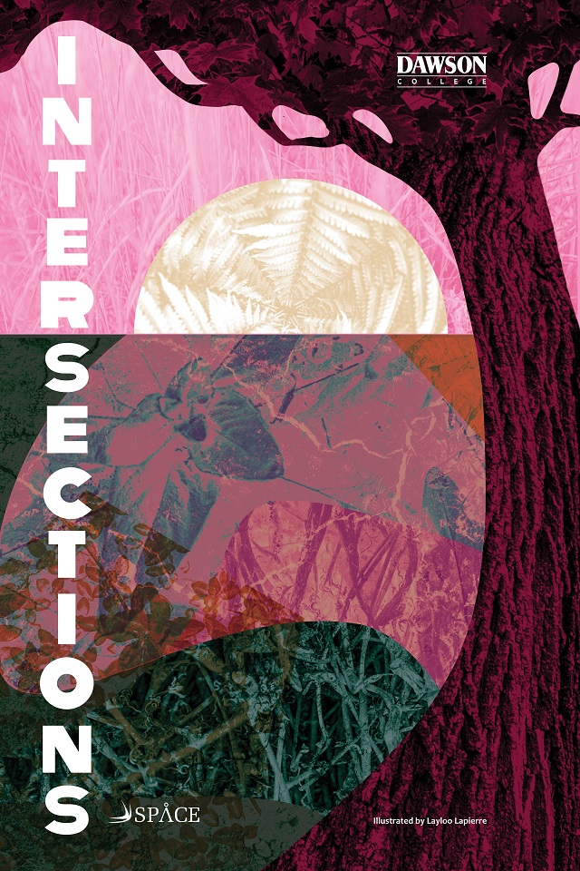
To get a clearer idea on the theme of Intersections, I looked up the definition in the Merriam-Webster online dictionary. It said: “A place or area where two of more things intersect”. I came to think that our entire world is made of intersections, from our society to chemistry, yet we humans tend to view everything with a limited, even binary lense.
Our project brief did put a lot of emphasis on the social movement of Intersectionality, to which the goal is highlighting how aspects of people’s identity (Gender identity, sexual orientation, culture, class, etc.) overlap, regarding oppression. So the binary lense isn’t helpful, especially in social movements, because we need to consider that often, people belong to more than one marginalized community at a time. Since I’m a queer, neurodivergent woman, that resonated with me!
So, with the definition and the direction of the project, I remembered Mycorrhizal networks. Basically, some types of fungi attach themselves to trees and plants for their roots to be connected and obtain more resources in the ground for less energy. In exchange, the plants feed the mushrooms. These networks even allow for nature to communicate! In other words, the diversity of nature is what helps it be healthy, even if some of it is under the surface. I thought comparing this to intersectionality was a positive outlook on the subject: talking more about it is an open door for curiosity, acceptance, growth and more. So I chose nature as a way to convey my vision.
All of this thought process led to my composition, in which you can see a tree in front of the horizon (a separation of what we see and what’s underneath). To represent diversity, and the overlapping of it, I used different shapes, from more organic to more geometric as templates for the texture of natural elements I captured with my camera. Then I added some colors and overlapped the shapes and textures with transparency and blending.
In the end this project expanded my view of Intersections, and allowed me to get out of my comfort zone artwise.
Layloo Lapierre is a second year Illustration student. You can view more of her work at:
https://www.instagram.com/mycrazycolouredmind/
Viviane Tran-Le
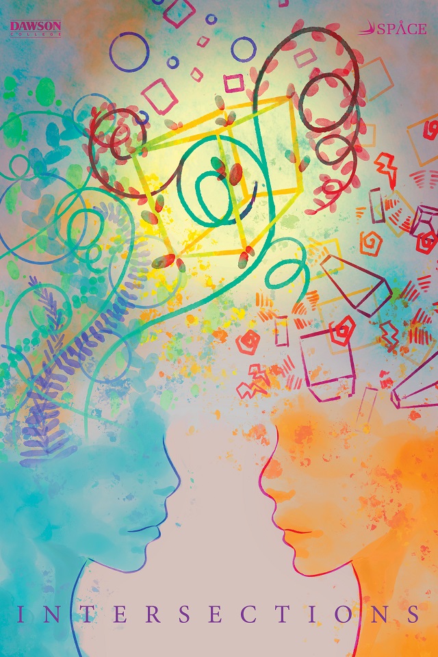
When initially presented with the subject of intersections, I was perplexed. Intersections was somehow such a broad subject. It could be intersecting shapes, intersecting concepts, or even intersectionality. I decided to somehow incorporate it all in one piece, which gave the resulting poster.
I wanted to suggest the intertwining of different mindsets. To do so, I represented each side with contrasting elements, whether it be the color, shapes, or size. I also wanted to show how when two minds meet, there are changes and consequences. I embodied that with the vines blooming when they reach the outside of the cube.
Viviane Tran-Le is an illustrator studying at Dawson College. She is a Vietnamese artist presently based in Montreal, Quebec. She loves to work on character design and environmental concepts. Her style may range from realistic to semi-realistic, and her preferred medium is digital. She is a big video game fanatic and loves watching animated movies. You can see more of her work on her Instagram:
https://www.instagram.com/_b0e0e6_/

Comments
Davis Maria
March 11, 2026Each student’s interpretation of the theme “INTERSECTIONS” beautifully reflects their unique perspectives and artistic styles. From Evy Voyatzis’s exploration of human impact to Layloo Lapierre’s insightful connection to nature and intersectionality, it’s inspiring to see such diverse expressions of a complex theme.
https://drivemadio.io/
You have to be registered and logged in in order to post comments!