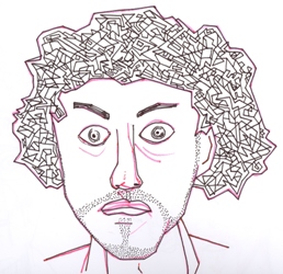
In this exhibit Patrick Shearing is "Exploring Spaces".
Remnants of the irregular Gaspé coastline can be found in these complex line drawings. As with fractal geometry, the closer one looks at a coastline the more detail there is to be found. Each small piece will still have its own bays, harbours, and capes so that no shoreline can be measured with perfect precision. In a similar manner, Patrick does not attempt to measure with his lines, but rather to draw out the inherent complexity and irregularities in the objects he studies.
Much of the work exhibited here is constructed with a minimum number of lines as Patrick traces out his observations in a continuous way, maintaining constant contact with the page. In also imagining abstract spaces a fresh perspective is achieved as all the work points to details seen only in the mind of the artist.

Recent work: Minimal cubist murals and complex line drawings.
Mediums: Ink, clay, wood, marker, pastel, and pencil.
Views on art: Art is the process of excavating one's innermost thoughts and transmitting them through some kind of manual dexterity. It is a form of exhibition and a means of communicating with yourself.
Patrick Shearing currently lives in Montreal’s St. Henri district but grew up along the rocky coastline of the Gaspésie. He is a graduate of Dawson’s Visual Arts program with wide ranging interests that straddle the arts and sciences.
Comments
t8cougars8
March 6, 2012This exhibit is beautiful. The drawings are masterfully created. Though their creation seems effortless, the viewer can tell that a lot of thought has been put into each line and each section of color. I have never seen art like this and I find it to be modern and refreshing. My favorite piece is “Montreal in the Sky” as it is the most ambiguous. What I mean by this, is that in the images of birds and even the one of the “Antigravity Castle”, the viewer can identify the subject of the picture instantly. However here, I was so intrigued by the design that I felt compelled to let the title load, so I could understand what the artist had in mind while drawing it. Now that I know that the inspiration was the skies of Montreal, I can interpret the painting from a completely different point of view. I thoroughlly enjoyed this exhibit and look forward to seeing more!
KevinC
December 1, 2013Patrick Shearing have a lot of creativity. The pieces that he made is really original and he have very nice potential.The style of drawings remind me of my childhood,i was drawing colorful lines that resemble of a bit of Labyrinth.My favorite piece is “Antigravity Castle” because its looks like the castle reach the sky It remind me of a cartoon. I really liked all his pieces because it brought back my past when i was a kid and it feels good to see some pieces that related to memories.
itscindytho
February 25, 2014I love this exhibit. The use of negative space is used as an advantage. When we do abstract pieces, we tend to bunch everything up, but Patrick used the space to his advantage. My favorite piece has to be ‘‘Niels Bohr from Memory’‘. I love the colored scribbles in the back and the ‘stain’ in front of the whole face. It feels as if he tried to draw someone without looking at a picture and forgot some of the details from the person’s face and blurred out the things forgotten. Great exhibit.
Kaity_Kaity
March 1, 2014I really enjoy this exhibit and the study of space, lines and pattern. All of his pieces are so simple and I think that is what intrigues me the most. My favorite piece is “12 constructions”. Each image resembles a doodle representing a bird, and what i like the most is how each one seems to gain their own identity based on how different they are from one another. Some are simpler than others, but each one experiments with styles and the grey scale. I was debating whether or not this piece would look best in color or in black and white. I still haven’t truly decided. I really enjoy the composition as whole, having all the birds perched next to one another was a great idea on Patrick’s part because then we get to compare the different studies closely which is just fantastic. In general,very creative, fun and admirable work. I hope there is more soon. 😊
sartistic
March 6, 2014I like the way it uses negative and positive spaces to make an image, this is what attracts me the most. Also the fact that if you turn the image around you can get another one. The use of colour is very important in some of the work because that is what brings out the image. You look at ‘Feynman’s Play Prism’ you feel like you want to put your finger on the paper and follow the lines and find the positive and negative spaces.
arip
December 7, 2014I quite enjoyed this exhibit and found it very intriguing. Each picture, upon first glance, was beautiful but after taking time to look at the details the pictures became magnificent. By using basic shapes and colours the pictures stick out and each detail becomes highlighted. One picture in particular that I quite enjoy is the first one. The picture is made up solely of black and white lines. However, using these two shades the picture almost looks 3D and has infinite details that are nice to look at and admire. This exhibit just goes to show that taking time to explore each of these picture reveals the true beauty behind them. The simplicity of these drawings creates something more and puts together each masterpiece. Well done on these beautiful pictures and creating this exhibit.
You have to be registered and logged in in order to post comments!