
Space s Theme Poster
During the Winter 2020 semester, in a co-curricular collaboration between SPACE and a 2nd year Illustration class taught by Stephanie Aubin, nearly 30 students met with SPACE coordinator Andrew Katz to discuss various aspects of the upcoming SPACE theme: space s. Under the guidance of Stephanie, and while checking in periodically with Andrew, these students developed proposals for the poster that would serve as the public visual representation of the 2020/2021 theme.
These proposals were reviewed by the SPACE coordinators along with Illustration teachers Stephanie Aubin, Mark Sy—Stephanie’s predecessor in leading this co-curricular activity—and Meinert Hansen. From the 29 submissions, 7 were chosen to present to the judging committee. The presentations which took place over Zoom included both the students’ poster and their statement about the connection between their work and the space s theme.
Six of the poster presentations, including five by the finalists, appear below. As we are every year, the committee was impressed by the thought, attention to detail, skill and professionalism that each student displayed in their proposals.
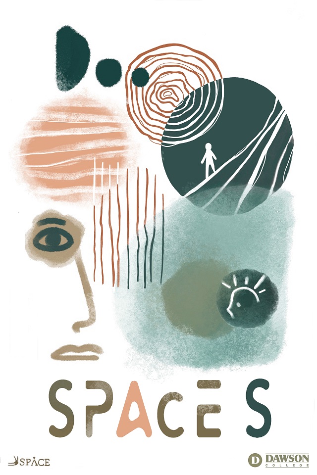
Directly below is the winning poster designed by Miranda Clarke.
Miranda Clarke
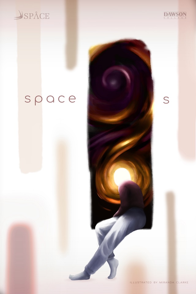
In my poster design I wanted to represent the nature of space as a piece of interaction, collaboration, and movement. Through the visualization of an abstract plane with windows to other spaces I hoped to invite the viewer to think about the gaps and overlaps within spaces and the concept of space as both a tangible thing and an abstract concept.
Also, I hoped to suggest the importance of thinking about space through the narrative created by the figure. The glowing head of the figure and the swirling shapes in the window serve to represent the occurrence of thought. I wanted to highlight how space influences our thoughts and vice versa. I also felt these glowing and magical elements helped attract the viewer's attention as well as invite a sense of exploration and intrigue.
Lastly, I put this area of interaction between the figure and its environment within the title to re-enforce the goal of the literal space in the text: to suggest an opening for imagination, interpretation, interaction and exploration.
Miranda is an illustrator who enjoys working in a variety of different styles while always maintaining an emphasis on composition, lighting, and narrative. She is particularly drawn to character design, storytelling and 2D animation. You can view more of Miranda's work here.
Amara Burnett
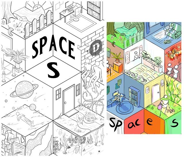
The idea was to conceptualise how everyone has their own personal space, and how those spaces then intersect with each other—all individual and unique, but still connected to form a whole.
Amara Burnett is a digital illustrator and painter with a passion for weird art and visual storytelling. You can see more of their work through their Instagram.
Emily Nickerson
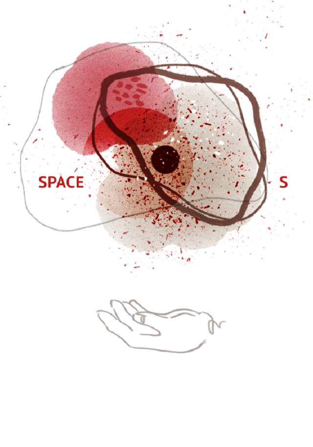
My idea started as a simplification of space and the idea of it being transient and ever-changing. I wanted to explore the place in between the visible and the invisible. By using something known: the cell with the nucleus and all of its components and melding this with something more chaotic like elements of outer space.
This created a new environment that rests in between; a place that is open to interpretation, and invokes traces of something that has since left—but that we are still trying to understand.
Emily uses her background in fine arts to inform her illustration practice. She is enthusiastic about expanding both her storytelling and character development alike. More of Emily's work can be found here.
Christopher Olson
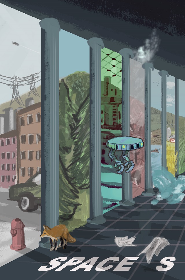
When I was told that the theme would be spaces, my mind immediately went to the history of illustrators creating impossible spaces that upend our expectations and challenge our comprehension. As a fan of science fiction and fantasy in general, I wanted to explore a common theme in genre fiction: alternate histories and diverging timelines. This isn’t an abstract exercise, however. Whether it’s a public debate about increasing biking and walking lanes or how to avert climate disaster by better management of the land, humans are in constant negotiations with the shape of their environment and deciding how it will appear to future generations. In my illustration, a hallway with multiple pillars looks out onto a mountain landscape, with the spaces in-between the pillars revealing a different manifestation of that landscape: A dense modern city stands next to an equally compressed pine forest, while a futuristic (or alternate present) landscape contrasts with the charred remains of a wood.
The contents of each scene spills out into the other, as the water from a reality in which beavers have changed the course of a river begins to flood the rows of wheat in an adjacent farmer’s field.
Christopher Olson is a writer and illustrator from Montreal, Quebec. His work has appeared in Fantasy & Science Fiction, and he is the creator of Tremendous Tales, a collection of illustrated micro fiction stories. As an autistic adult with ADD, he feels inclined to create works of art that are small but deep in scope. While accommodating his limited attention span, brevity also allows him to explore the breadth of his artistic interests. He is currently studying Illustration at Dawson College. You can view more of his work through his Instagram.
Karen Senneron
Throughout the concept of my poster design, I decided to explore and express the types and dynamics of what we consider spaces. In order to materialize the diversity of this concept, I decided to adopt an abstract disposition as well as the human influence on those spaces. For example, the concrete and crisp shapes of this design express density and closeness. Some more textured shapes, however, contrast with the notion of unsureness and inconsistency about the limits of a space. Furthermore, every shape in the composition interacts with each other to expand in various ways. Some are layered on top of others, while others constitute a bigger body, similarly to an organism. Some other human elements add to the design, such as a thinking head to represent mind space or a human silhouette living inside a shape to represent human’s perception of a space.
Karen Senneron's work always focuses on communicating emotions and set moods throughout fantastic tales and magical environments. She specialized in diverse styles and formats, from realistic portraits and renderings to very abstract designs and shapes, all using a digital medium. Her main source of inspiration comes from nature, the aesthetic of organic elements such as rocks, trees and natural lighting. She may also work with graphite, ink and watercolor during her studies.You can view more of Karen's work here.
Billy Mann Velicaria
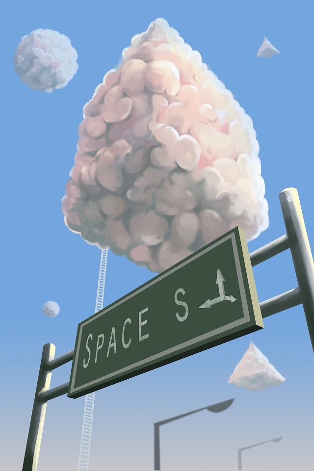
When we hear the word “space”, the first thing we think about is the zone above our planet. We see images of planets, stars and the moon. We never realize that the word “space” has so much more meaning. Space is infinite like our creativity and imagination. We are constantly in our thoughts and it always changes. In the world we live in, we are gifted with knowledge and curiosity. Everything we see has different shapes and sizes, which made me think of the space we live in. Space could also be distance or time. I represented the geometrical clouds as the imagination of a human. Everyone can use their imagination and is not necessarily for artists. For example, for a kid, a cloud could be seen as a shape of an animal or an object. An adult could see it as a symbol of freedom. The ladder represents the connection between the ground where we live and the sky we explore.
Billy Mann Velicaria is an illustrator and a concept artist studying in Dawson College. He is a Filipino artist with big passion to video games. He loves to work on environmental designs, creature designs and storytelling.
You can find more of his work through his Instagram.
Comments
saintluccatgirl0829
June 15, 2020wow billy!
Pol
August 31, 2020Reading this article was very intriguing in my opinion, because it puts into words the amount of thought that went into every single piece of art the illustration students have proposed to the SPACE S coordinator. I think it explains very well to the reader how much work goes into the creation and execution of an original idea for something as commonly seen by people as a poster. Something that viewers can easily forget if they don’t pay enough attention to what they are seeing is that every detail in an illustration is there for a reason, which is fascinating to think about when looking at others’ artwork. It is especially captivating to read the explanations behind the pieces that go into a more abstract direction. There is always a deeper meaning that can be found in something that might not make any sense to us at the first glance.
Gabriela
August 31, 2020All these posters are beautiful and far interesting, the one who seems to have pulled my eye is Billy’S Mann Velicaria’s poster. His poster intrigued me the most, because of his explanation on the different perspectives that englobe the space. He somehow also explains the different mindsets of imagination that we can have when I comes down to perceiving things, as small as they can be. He pointed out out our aptitude to carry knowledge and have curiosity with what surrounds us which makes us constantly change our thoughts on our every day life. I really loved the way he expressed his art poster and how he designed it based around the space idea. All the artist clearly put hard work into their art and made amazing poster’s about space.
marina genovesi
August 31, 2020There is something about how each illustrator describes their painting. It feels like you can understand where they’re coming from, and what they’re really trying to tell you. The one that stood out to me the most would have to be the drawing by Emily Nickerson. There is something about her short description that just makes me wonder. How she just simplifies space by calling it ‘transient and ever changing.’ The world, the space and the universe is ever changing. Everything that you do, everything that you say will always change the outcome. To ‘explore the places between visible and non visible’ you must need to know what you’re looking for in everything, in the ever-changing space. There are always things that are always going to leave you questioning why that happened, or why fate had changed. Everyone’s opinions, everyone’s space, changes with actions, words and through their soul.
Marie-Sophie Chapelle
September 1, 2020The posters presented were clearly made with careful consideration and amazing creativity but, the winning poster, created by Miranda Clarke, caught my eye the most. The intricate details and clear coexistence between human and space sparked my interest and compelled me to stop and have a second look. The fact that space is this vast concept that we have barely explored can be deduced by the fact that the character on the poster barely immerses his head in the window that is the universe. The person also does not look distraught but rather seems to embrace the idea of not knowing how to explain everything. I feel like the author of this piece gave life to the words of Billy Mann Velicaria, which are “Space is infinite like our creativity and imagination.”
sarah alameen
September 1, 2020the first poster which is illustrated by Miranda Clarke really cought my attention, because looking at the poster and reading what you wrote, I can tell the great connection between the discription and the visuals, you showed space in many different ways and the most noticable and spot on is the movement, the shapes and colours show how dynamic the poster is, the background seems like either flying or falling due to the rectanguler shapes, and the circles are more swirlly, it really is amazing, in addition, the guy with the light instead of his head, the light looks like the core or the most eye-catching point of the poster, and for some reason it feels like he is going to fall in a different dimension.
sungsilpark
September 3, 2020The posters fascinated me with their different form of the art and explication of the meaning. Among them, Billy Mann Velicaria’s poster mostly caught my attention, because his explanation was so true. There is so many things that have different sense other than the word “space”, because each person has a different opinion and point of view. The way that the illustrator demonstrated the example with a cloud made me another surprise. It was a good example to represent that people don’t have the same imagination and visualization. There is not always one perfect answer that we can find, but there is multiple choices.
You have to be registered and logged in in order to post comments!